The iOS 10 Review: Refining the iOS Experience Both Over & Under the Hood
by Brandon Chester on September 13, 2016 12:00 PM ESTExtending iMessage
The Message app is the most used application on iOS. This isn't really a surprise when one thinks about how people use their phones, but it does identify an area that the developer community hasn't been able to tap into despite users spending a great deal of their time there. For someone like me, it was difficult to imagine that there really was anything that developers could do with iMessage, as my use case is just sending images, videos, and text in the same way that you could with SMS and MMS. Of course, I make use of some other convenient features like group chats, read receipts, etc, but none of these areas seemed to present a way for third party developers to add value. Of course, that's when I think about how I use messaging, but there's a whole world of messaging beyond the most basic functionality that SMS and iMessage provide. Apple is tapping into those ideas for iMessage in iOS 10, and they're bringing developers along for the ride.
Apple has taken a two pronged approach to upgrading iMessage in iOS 10. The first are the features that come by default, the features that are part of iMessage itself. I actually covered some of these in my macOS Sierra preview, although in a limited manner as macOS Sierra is not capable of using most of the new features itself and is just able to receive messages that use them. The two main features added to iMessage by default in iOS 10 are message effects and Digital Touch messages.
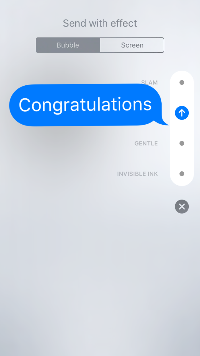
Message effects work as you'd expect, with animations that can be applied to the actual message bubble itself or as an effect that plays in the background behind the scrolling list of messages. For bubble effects Apple provides an invisible ink effect that requires you to swipe across the message to reveal it, a gentle effect with tiny text, a loud effect which enlarges the bubble for a moment when it's viewed, and a slam effect which crashes the message into the screen, complete with dust effects as it touches down. As for screen effects, you have balloons, confetti, lasers, fireworks, and a shooting star. There's not a whole lot else to say about message effects, as other messaging apps have implemented these features before. If you're a fan of them then you'll be happy to see them brought to iMessage, and if you're not you'll just have to hope all your contacts feel the same way.
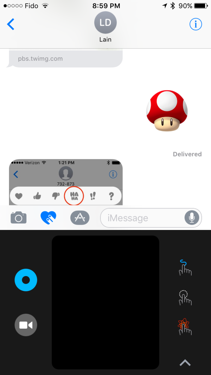
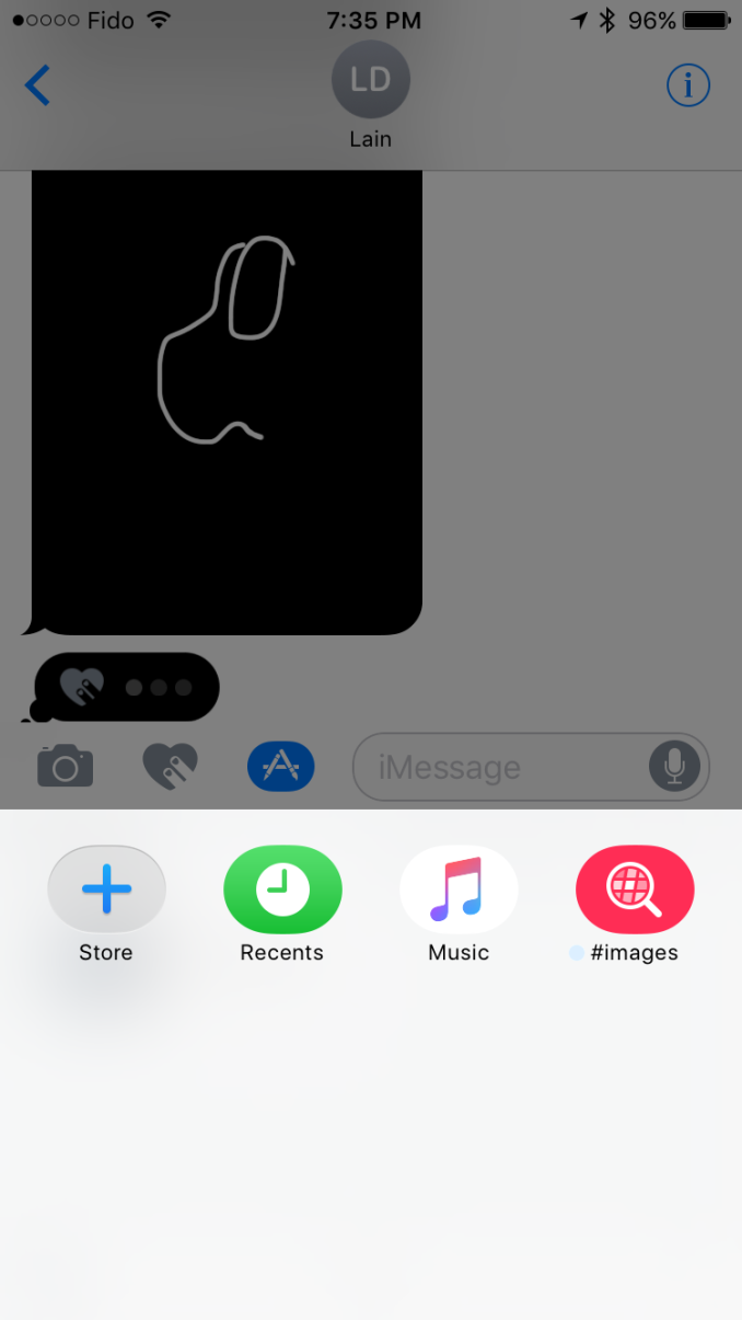
Anyone who has used an Apple Watch will be familiar with Digital Touch. In this case it has been modified since you're using it from an iPhone instead of a watch, and the list of things you can send have been expanded as well. To bring up Digital Touch you simply tap the icon with two fingers on a heart which sits next to the text entry field. Once you do so you'll be presented with a condensed version of the Digital Touch UI in the space where the keyboard would normally be. This UI works in a similar manner for iMessage apps, although I'll touch on that more in a bit.
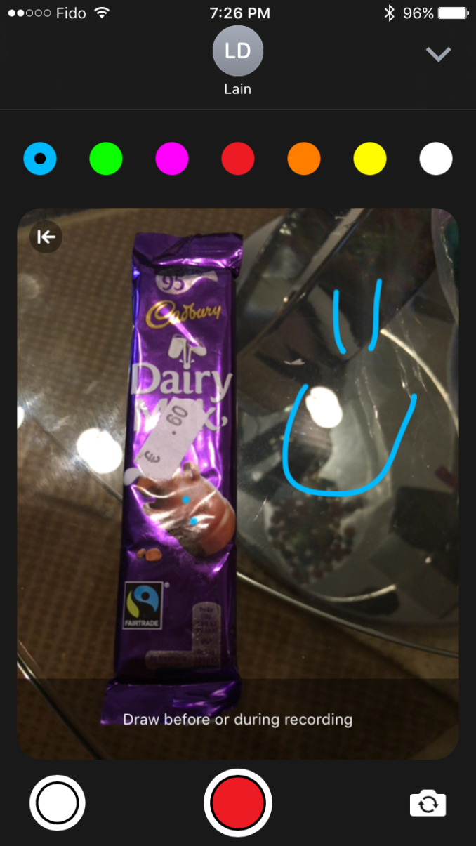
In the condensed UI there's a small drawing canvas where you can perform Digital Touch actions. On the left side you have a button that allows you to change the color of the pen used when drawing, and below that is a camera button which expands the UI and allows you to draw on top of a photo taken with the camera.
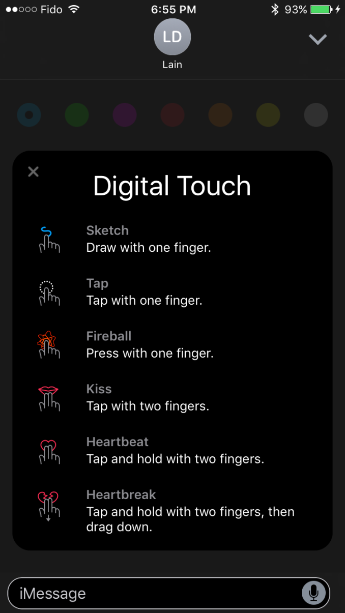
The expanded UI will first show a preview of all the actions you can perform. These all work in the condensed UI as well, but you may not know about all of them until you bring up the expanded version as the condensed view only shows three actions on the right side and switches between two sets every few sections to show all six. To be honest, the Digital Touch interface is kind of confusing, and I wouldn't be surprised if it receives some tweaks in future minor updates to iOS 10. I'm don't really much value in Digital Touch on the iPhone either, especially since actions like tapping don't translate well from the Apple Watch where it would actually trigger the Taptic Engine to simulate your wrist being tapped.
The second side of the iMessage improvements is the creation of a developer ecosystem centered around iMessage. This API will allow developers to create their own mini-applications that run inside of iMessage. This really covers three types of applications, the first of which being sticker packs, the second being interactive messages, and the third being other types of apps that work with media. You can see an example above of the new Super Mario Run sticker pack which is available in the iMessage app store. Interactive messages cover applications that send messages with content which can then be opened by the receiving user in the corresponding application. Apple's example was sending a message with the menu for a party being planned, which can then be modified and commented on by the receivers. Finally, the other category of app is for working with media, and an obvious example is implementing a GIF application for sourcing reaction images in the iMessage app itself.
I'm not really someone who makes heavy use of emoji or effects in message apps, and so I don't have a whole lot else to say about the changes Apple has made to iMessage in iOS 10. However, the popularity of these features in other messaging apps makes it clear that many users value these capabilities, and so it makes perfect sense for Apple to bring them to iMessage. Most interesting for me is the idea of the iMessage App Store, and whether or not it's going to be possible to monetize applications like sticker packs. Line has already shown that people will pay money for such things, but that relies on developers not rapidly creating a race to the bottom for prices, which is what has happened in the iOS App Store to an extent. Like many of the new technologies that Apple introduces in new versions of iOS, only time will tell how things play out.






113 Comments
View All Comments
Agent Smith - Tuesday, September 13, 2016 - link
What's the release date?tipoo - Tuesday, September 13, 2016 - link
Today.tipoo - Tuesday, September 13, 2016 - link
Interesting about scrolling performance, I wasn't sure if I was imagining it wasn't all it used to be. Great that Apple admitted and addressed it.sonicmerlin - Tuesday, September 13, 2016 - link
Exactly. I thought I had noticed a tiny bit of judder while scrolling in safari on my 6S.I'm really glad to see Apple noticed this and put a lot of effort into fixing it. It may not seem like a big issue, but this is one of the biggest reasons I can't stand Android. The garbage collection hiccups and lack of pixel perfect smooth scrolling, especially while browsing heavy web pages or zooming in out and out of google maps, drives me nuts.
Ranger1065 - Wednesday, September 14, 2016 - link
That has to be one of the most pathetic examples of 1st world problems I've read.milli - Wednesday, September 14, 2016 - link
Reminds me of many years ago when I had a Nokia N8. Its Symbian OS had much more features than what an iPhone had back then but ... the iPhone had smooth(-er) scrolling and looked prettier.We all know what happened. For humans: looks > usefulness
Brandon Chester - Wednesday, September 14, 2016 - link
Performance is a feature.close - Wednesday, September 14, 2016 - link
@milli. Because 5000 years of history showed that humans look *ONLY* for objective characteristics in anything and the iPhone somehow managed to break the pattern.@Ranger1065. Whatever *YOU* want or like can be considered a first world problem by someone else, right down to the fact that you're here complaining about what other people want or like.
Ranger1065 - Thursday, September 15, 2016 - link
LoLrangerdavid - Thursday, September 15, 2016 - link
This.