The Motorola Moto G4 and G4 Plus Review
by Brandon Chester on August 15, 2016 8:00 AM EST- Posted in
- Smartphones
- Lenovo
- Motorola
- Moto G
- Moto G4
Display Analysis
One of the standout features of the original Moto G was its display. It was a 4.5" 1280x720 display, which gave you a higher pixel density than many other smartphones at the same price which still used 960x540 displays. It certainly wasn't the best calibrated display, but for its time it was one of the best you could find in a mid-range smartphone.
Fast forward to 2016, and we now have $200 mid-range phones shipping with 1920x1080 LCD displays. Phones have also continually gotten larger, with 5.5" seemingly being the new norm for mid-range devices. The Moto G progressed from its original 4.5" display to a 5" one with the 2014 and 2015 models, and has now gotten even larger with the 5.5" display on the Moto G4. Like competing smartphones, the Moto G4 also moves to a resolution of 1920x1080. I really feel that this continued increase in size has been at the expense of usability, but I've already mentioned that in this review, and at this point consumers don't really have any smaller alternatives at this price point anyway.
While the first three models of the Moto G maintained a 720p resolution, Motorola improved the accuracy of their displays as well as other attributes like the peak brightness and black levels. With the Moto G4 moving to a 5.5" 1080p display, I'm curious to see if there have been similar improvements to attributes beyond size and sharpness. To examine the display in greater depth than what is presented on a spec sheet, I've run our standard suite of display tests. As always, measurements are performed with an X-Rite i1Pro 2 spectrophotometer, and managed using SpectraCal's CalMAN 5 software.
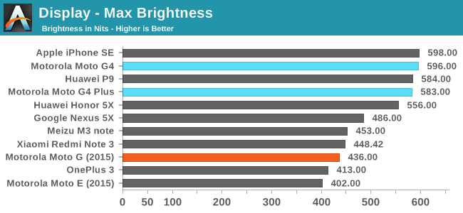
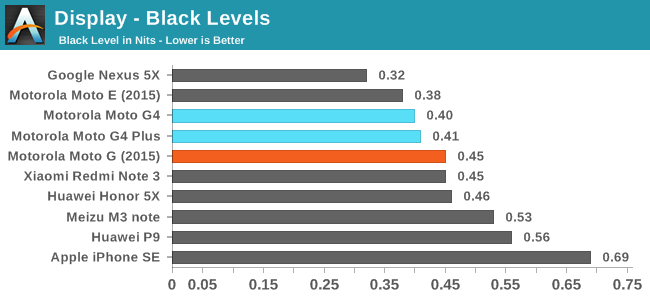
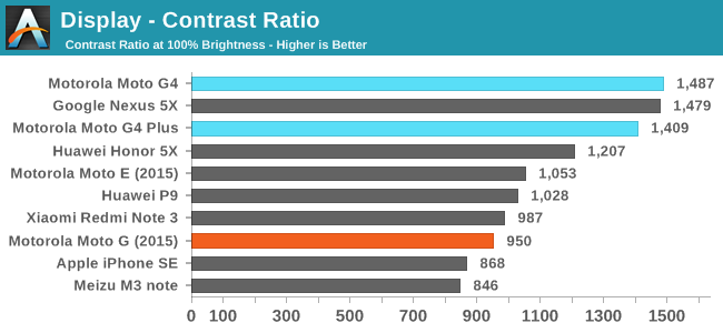
Both the Moto G4 and G4 Plus achieve a high peak brightness, as well as a relatively low black level relative to that brightness. This leads to the G4 achieving the highest contrast ratio that I've seen on a device at this price point. Among the mid-range devices that I've chosen for comparison, the Moto G4 definitely has the best display as far as brightness and contrast is concerned.
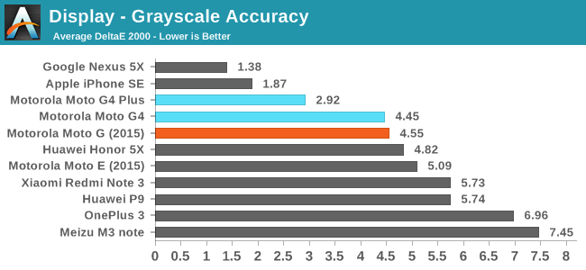
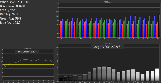
Moto G4 Plus DeltaE 2.92
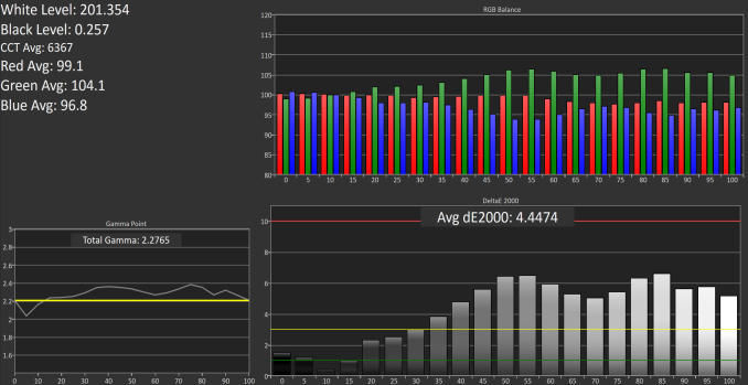
Moto G4 DeltaE 4.45
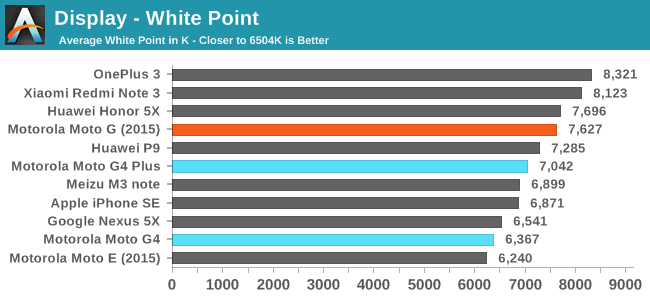
Having two devices with the same LCD presents an interesting situation where the two can be compared to examine the degree of variance with the calibration. It was clear to me right after I turned on both phones that the normal Moto G4 exhibited a slight green tint and was warmer than the Moto G4 Plus, which was definitely shifted more toward blue than our target white standard of D65. In both cases gamma is a bit high, although this is more pronounced on the Moto G4 Plus. It's also clear that between these two units, the Moto G4 Plus exhibits a greater level of accuracy. For a phone that starts at $200, I would consider both results to be acceptable, but the greyscale accuracy on the G4 Plus unit is definitely a step ahead of the normal G4 unit.
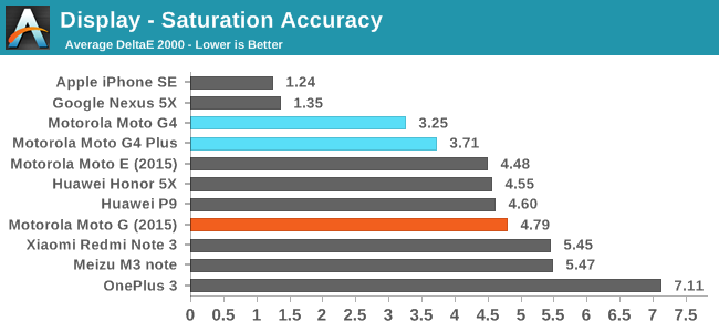
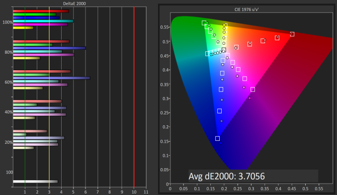
Moto G4 Plus DeltaE 3.71
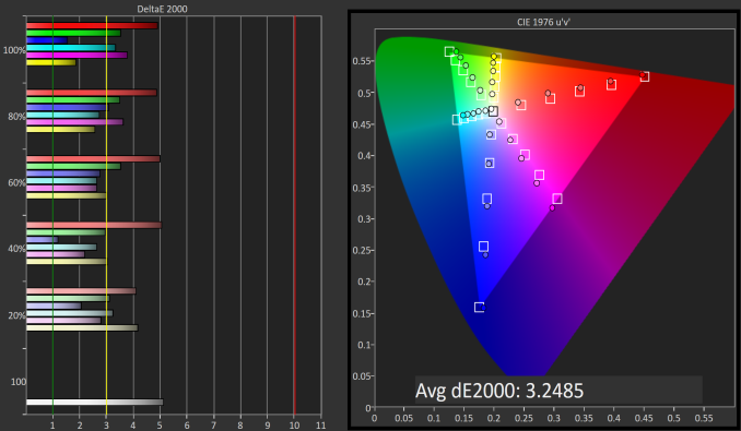
Moto G4 DeltaE 3.25
The tables turn when examining saturation accuracy, as the normal Moto G4 demonstrates a slightly greater level of accuracy. The Moto G4 Plus has higher error levels with blue, cyan, and magenta due to the blue-shifted greyscale. Again, in both cases the display is more than acceptable for a $200 smartphone, but it is interesting to see what tolerances Motorola has for display variance from one unit to another.
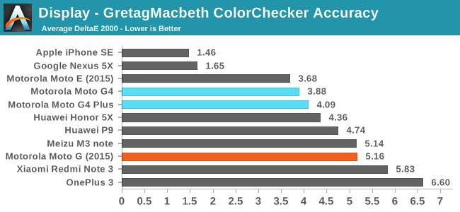
Moto G4 Plus DeltaE 4.1
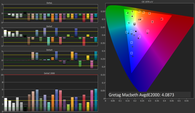
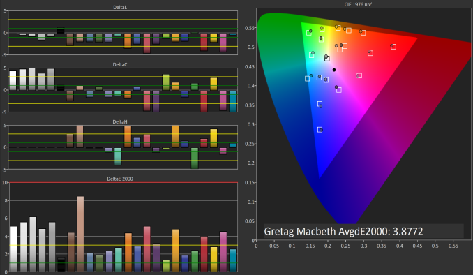
Moto G4 DeltaE 3.88
Accuracy in the GretagMacbeth ColorChecker test is very similar between both Moto G4 units, but the normal G4 again has a slight advantage. This difference is mostly academic, and I would actually argue that you'd be better off with the G4 Plus because in this case the normal G4 has a critical error in the light skin shade, which is a color you're likely to come across more so than others. Ultimately both displays are very good for the price, and I don't think users are going to have any issues with the level of accuracy if it can be assumed that all Moto G4 and G4 Plus phones have similar calibration.
Drawing conclusions about displays can be a bit difficult when you have two devices to compare. On one hand, my less accurate unit could be exceptionally poor. On the other hand, my more accurate unit could be exceptionally good. I can only make concrete conclusions based on the data I've collected, and so it's probably best to evaluate based on the worst results. In this case both devices were similar enough, although the G4 Plus has the display I favor because green shifting in the greyscale is something I find much more bothersome than blue shifting, as I've gotten used to the latter due to its pervasiveness on WLED-backlit LCD displays.
The fact that both displays were relatively close in their accuracy hopefully indicates that users can expect this level of accuracy on any Moto G4 device, although I can't say that for certain. Based on the information I have, I'd say that users buying a Moto G4 should be getting a display that is exceptionally bright, with good black levels, and decent color accuracy, and I think that makes for a pretty good $200 smartphone display.




94 Comments
View All Comments
kspirit - Monday, August 15, 2016 - link
The fingerprint scanner on the front ruins the look with the bottom bezel... They should have placed it on the back. Otherwise seem like pretty good phones for the price. Hopefully Moto keeps them updated instead of what they've been doing with their last few devices.nevertell - Monday, August 15, 2016 - link
Do you enjoy not being able to unlock a phone whilst it's laying on a table, screen facing upwards ?I certainly don't.
smartthanyou - Monday, August 15, 2016 - link
Seems a pretty simple thing to just pick it up and unlock. If it is a place you frequent such as work or home, you can set it up to automatically unlock.mrochester - Monday, August 15, 2016 - link
How do you get it to only unlock when it's you who is using the phone?snowmyr - Wednesday, August 17, 2016 - link
Try the fingerprint sensor.markiz - Monday, August 15, 2016 - link
This is something that is painfully obvious to me, so my I am really, really confused when people insist that fps on the back is better.johnsonx - Monday, August 15, 2016 - link
I have the ZTE ZMax Pro, which is a very similar phone to the G4 Plus, but the fingerprint sensor is on the back. I almost always pick up the phone to do anything with it, and having the fingerprint sensor on the back is natural. However it does also have numerous secondary unlock methods, several of which work without picking up the phone. Presumably the G4 Plus has similar features.Cod3rror - Monday, August 15, 2016 - link
Agreed. The back where the dimple is seemed like the obvious choice where the FP sensor would go.markiz - Monday, August 15, 2016 - link
Again, you have no problem with having to pick up the phone ALL the time?Cod3rror - Monday, August 15, 2016 - link
How often you use your phone when it's on its back compared to holding it in your hand? Most people pick up their phones purely as a habit now.