Microsoft Surface 2 Review
by Anand Lal Shimpi on October 21, 2013 12:00 AM EST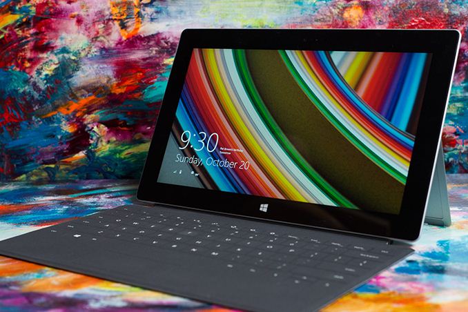
A year ago Microsoft first threw its hat into the tablet race with a new brand, a new OS and a completely new strategy. To make a challenging situation even more difficult, Microsoft chose to go after the traditional tablet market with a device that was neither a tablet nor a notebook.
I was relatively pleased with both Surface devices that launched last year. Surface RT had potential, but it was too slow, needed a price adjustment and of course needed more maturity on the OS side. Surface Pro on the other hand needed to be thinner, needed Haswell and related, it needed better battery life.
With its new commitment to being a devices & services company, Microsoft now joins the ranks of Apple and Google in shipping platforms with annual updates to hardware and software. Last week we saw the software side of the story, with a free update to Windows 8.1. It wasn’t too long ago that Microsoft was charging hundreds of dollars for new OS revisions, but with Apple and Google redefining what users come to expect from both cost and frequency of OS updates, Microsoft had to change.
Today we get the second half of the story. Microsoft’s partners have already announced their Windows 8.1 launch devices, now it’s time for Microsoft.
I’ll start with Surface 2, which sees the largest number of physical changes compared to its predecessor. It’s still built using the same injection molded magnesium manufacturing process (VaporMg, pronounced vapor mag), but moves to a 2-piece VaporMg design similar to Surface Pro. There’s the VaporMg tub and the kickstand.
The look and feel of the device see substantial updates. The finish of Surface 2 is now a light silver. Not only does the new finish not pick up grease/fingerprints like the previous black finish, but it also has a slightly more textured feel to it. Staring at Surface 2’s display head on you get a little bit of a silver border around the display, a nice touch. Surface 2’s construction feels every bit as solid and expensive as its predecessor. Both devices remain the absolute best built Windows tablets/notebooks on the market.
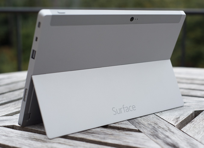
Curiously enough both Surface 2 and Surface Pro 2 ditch the Windows 8 logo on the back of the kickstand in favor of a Surface logo. The devices in general continue to be devoid of excess branding. Both have a capacitive Windows button up front, the aforementioned Surface logo around back and some branding on their respective chargers. There are no stickers to remove, and no COA labels to worry about. It may be years later than we’d hoped, but Microsoft finally gets the beauty of clean aesthetics.
The overall dimensions of Surface 2 don’t change much compared to its predecessor. We’re still dealing with the same 10.6-inch display size, although it sees an update to a 1080p panel with improved color accuracy. The panel size determines the overall device footprint, which explains why that doesn’t change this round. Thickness goes down a small amount from 0.37-inches to 0.35. The reduction is very subtle but helps contribute to the device feeling more right in hand.
Weight improves slightly if you compare Surface 2 to Surface RT. While the latter weighed in at 1.5 lbs, Microsoft lists Surface 2 as weighing less than 1.49 lbs. The somewhat vague spec is designed to take into account variations in manufacturing. Microsoft encouraged me to weigh my Surface 2 review sample, which came in at 1.45 lbs compared to a flat 1.50 lbs for Surface RT. It’s a small difference, but a definite step in the right direction. If the rumors of a lighter iPad 5 are true however, I do wonder if Microsoft should’ve been a bit more aggressive on the weight reduction front this round.
Just as before, Microsoft stresses the importance of looking at weight distribution not just overall weight specifications. Truth be told, Surface 2 doesn’t feel as heavy as the iPad despite having very similar weight specs.
A big part of the Surface story is the device’s integrated kickstand. The best way to talk about the improvements to the kickstand in Surface 2 (and Surface Pro 2) is to quote what I said about the previous design:
“The more I use Surface (Pro and RT) the more I feel that Microsoft needs to pursue something a bit more flexible than the fixed 26-degree kickstand. The biggest issue by far is in-lap use with one of the keyboard covers attached. Depending on your seating position, the 26-degree angle that the kickstand opens at might be too small. Mechanically I don’t know the right solution for Microsoft but I do feel like for the kickstand to realize its true potential, it needs to be able to open and hold at multiple angles. It doesn’t necessarily need to have support for infinite angles, maybe even a few would work, but I do believe it’s necessary going forward.”
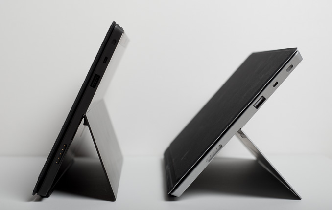
Well, wouldn’t you know, Microsoft listened. Surface 2 and Surface Pro 2 both feature a new, 2-stage kickstand. You still get the same solid action, same sound and even the same 24-degree opening angle, but now there’s a second stop in the kickstand’s travel at 40-degrees. The 2-stage design almost completely addresses my issues with the first generation of Surface tablets. While the 24-degree stop is perfect for desk use, the 40-degree stop is ideal for in-lap use. The second stop keeps me from having to strain my neck looking down at the display when I’m typing in cramped quarters (e.g. having to type out this review in the back of a car heading to an airport).
Moving between stops on the new kickstand feels natural, and the new kickstand feels every bit as robust as its predecessor.
I don’t know that Microsoft has perfected the design though. I could still use another stop (or two). Perhaps one at 15-degrees for the on-chest use case if I’m laying down with the tablet on my chest watching a movie. A real issue created by the 40-degree stop is now I need even more leg/thigh/lap-space to support the device. Since there’s no support to hold the display up until you get to the kickstand, you need to make sure that the kickstand has a place to rest when open at its widest angle. I don’t know the right mechanical solution to this concern, but I still feel like Microsoft has some more work ahead of it on the kickstand front.
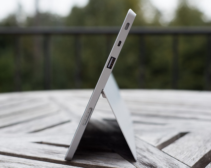
Behind the kickstand is a repositioned microSD card slot. It’s now further away from the kickstand hinge.
The ports/buttons around the edges of Surface 2 haven’t really changed compared to Surface RT. On the left you’ll find volume up/down buttons (which are appreciably clickier compared to my Surface RT review sample), a headphone jack and one of two speaker ports. On the top right there’s a power/lock button. On the right side you’ll find the other speaker port, micro HDMI output and a USB 3.0 port (new for Surface 2, RT only supported USB 2.0). All of the Surface devices retain the same custom, magnetic power connector as before.
Along the bottom there’s a slightly updated accessory connector and channel for accepting Surface’s famed keyboard covers, as well as new accessories this round. All first generation Surface accessories are supported.
Both front and rear facing cameras get a big upgrade with Surface 2. Surface RT shipped with two 1.2MP cameras, while Surface 2 moves to a 3.5MP front facing camera and a 5MP rear facing camera.
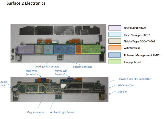
Internally, the upgrades are even more substantial. NVIDIA’s Tegra 3 is out of the picture, replaced by a far faster Tegra 4 SoC. That’s four ARM Cortex A15 cores running at up to 1.7GHz (1.9GHz with only one core active), as well as a fifth power saver core that actually sees some use this time (more on this later).
WiFi remains dual-band 2-stream 802.11n on both Surface 2 and Surface Pro 2, although whatever peak performance issues plagued me on Surface RT seem to be resolved (I could hit 120Mbps max transfers over 5GHz 802.11n).
The tablet still ships with 2GB of memory, but now leverages a 64-bit wide memory interface. On the storage side the options are still 32GB or 64GB of eMMC.
| Microsoft Surface 2/RT Comparison | ||||||||
| Surface 2 | Surface RT | |||||||
| Dimensions | 10.81 x 6.79 x 0.35" | 10.81 x 6.77 x 0.37" | ||||||
| Display | 10.6-inch 1920 x 1080 w/ Improved Color Accuracy | 10.6-inch 1366 x 768 PLS | ||||||
| Weight | Less than 1.49 lbs | 1.5 lbs | ||||||
| Processor | NVIDIA Tegra 4 1.7GHz | NVIDIA Tegra 3 | ||||||
| Connectivity | 802.11n WiFi | 802.11n WiFi | ||||||
| Camera | 3.5MP front facing, 5MP rear facing | 1.2MP front facing, 1.2MP rear facing | ||||||
| Memory | 2GB | 2GB | ||||||
| Storage | 32GB or 64GB eMMC | 32GB or 64GB | ||||||
| Battery | 31.5 Wh | 31.5 Wh | ||||||
| Starting Price | $449 | $349 | ||||||
Battery capacity is still 31.5Wh and Surface 2 still ships with a 24W charger. Surface 2 will draw 10W at the wall while charging, the over-specced adapter is designed to be able to power the system at full load without impacting charge times.
On the software front, Surface 2 ships with Windows RT 8.1 and a full copy of Office 2013 RT Home & Student Edition. Pricing starts at $449 for a 32GB model, or $549 for the 64GB version. Touch and Type covers continue to be sold separately at $119 and $129, respectively.




139 Comments
View All Comments
ancientarcher - Monday, October 21, 2013 - link
This is a great improvement over the original Surface. The huge increase on the GPU front obviously made it possible for MS to offer the higher resolution screen and along with a better CPU made it a lot smoother to use.The king of tablets - yes. But then, no one talks about how ios is incompatible with OSX! It's only with MS that people expect 100/100 every time. Only if Windows RT had been compatible with the Windows Phone ecosystem. Then there would not be so much noise about the app ecosystem.
I am beginning to think how good a device this will be in a year or so, particularly if MS manages to merge the Windows Phone ecosystem with this (after all both run on ARM so should be theoretically possible). And yes, slightly lighter with better battery life needed. With a few more apps, this will be the perfect device.
kyuu - Monday, October 21, 2013 - link
Hmm, let's see:iPad 4 - 9.51" H, 7.31" W, .37" D
Surface 2 - 10.81" H, 6.79" W, .35" D
Surface 2 is thinner. It's longer but less wide due to the larger screen and 16:9 aspect ratio, which is better for pretty much everything except using it as an ereader. I don't see how it's "big and unwieldly" yet the iPad is magical. And then...
iPad 4 - 1.44 lbs.
Surafce 2 - 1.45 lbs.
I guess that extra .01 lbs. is all you need to make the difference between magical and heavy? Also I suppose you missed the part where Anand noted that, due to the weight distribution, the Surface 2 actually feels lighter in-hand.
Add in the fit & finish, the kickstand, and the facts that you have an actual honest-to-god USB port (3.0 no less!), a mini-HDMI out, and a much more fully featured OS with WinRT 8.1 than iOS will ever be, and I really can't see how the Surface 2 loses a value or specs comparison unless you're married to the iOS ecosystem.
cheshirster - Monday, October 21, 2013 - link
Another half-assed review of MS product.What about multitasking, storage options, external displays, browser capabilities (flash for example, on-site video playback), speakers, skyping comparison?
Why are those google services are so special so that one must care about them?
Steinegal - Monday, October 21, 2013 - link
Agree, you can still access Google services in your browser if you need it. You also get so many possibilities to connect any device you want through the USB port, like printers, scanners, mouse, keyboard, game controllers cameras etc. You also have a powerful multiuser environment something every android tablet that has a half assed implementation of gets a big plus for. For me it's the multitasking that seals the deal, my iPad is mostly used for Facebook, browsing and YouTube/Netflix, and the surface can do all of those at the same time. No more swapping app to reply to a message in Facebook, no more stopping the video to do a quick search for information. I might miss out on a few great apps, but mostly it's just games and I'm quite tired of all those pay2win games that seems to populate the appstores now.Gigaplex - Monday, October 21, 2013 - link
Multitasking? The software doesn't really do a good job of supporting that.Daniel Egger - Monday, October 21, 2013 - link
I have to disagree. While I don't give a rats ass about multitasking in a tablet (or phone) because the screen only allows modal operation anyway it works reasonably well even on the old RT. Almost too well because you'll only notice two Flash videos playing at the same time when the audio clashes.kyuu - Monday, October 21, 2013 - link
I have to agree. There's too much focusing on comparing it 1-to-1 to an iPad or Google tab and Anand seems to miss or gloss over a lot of the the functionality.1) Mentions the multitasking only in passing.
2) No mention of connecting accessories through the USB port, including external storage.
3) No mention of external display support, where you can actually EXTEND the display rather than simply mirroring it.
4) No mention of how the browser handles flash or works to bring up websites for Twitter or all those Google services that he complains are missing in the app store.
5) Not Surface 2 specific, but the quality of the speakers should be noted.
cheshirster - Monday, October 21, 2013 - link
What are the strong points of bringing in Bay Trail and "full" windows? Why we should even care? What exactly that "full" means in 10.6 inch tablet ?Qwertilot - Monday, October 21, 2013 - link
Its a good question actually :) Even if MS did put an atom into these, they may well backport RT rather than full 8.1.They rather badly need to drive the touch based eco system before these devices can make proper sense.
Gigaplex - Monday, October 21, 2013 - link
3rd party desktop applications, so you can actually use the device while you wait for useful Store apps to become available.